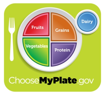
Last week we said goodbye to the food pyramid—our pictorial guideline for nutrition for almost 20 years—and said hello to MyPlate, our new visual guide for healthy eating. Introduced by first lady Michelle Obama, USDA Secretary of Agriculture Tom Vilsack and Surgeon General Regina Benjamin the new 2011 food guide was unveiled at a press conference at the Agricultural Department in Washington, D.C. Let’s take a look at this new graphic, and talk about what it means.

Image credit: USDA
The new MyPlate icon depicts a plate which is sub-divided and color-coded into sections which represent what we refer to colloquially as “food groups”: green represents vegetables, orange represents grains, red represents fruits, purple represents protein, and a small blue circle next to the plate represents dairy. The largest single sub-section of the plate is vegetables and when combined with fruits, makes half of the plate; grains and protein take up the other 50% of the plate, with the suggested grain intake being slightly higher than the suggested protein intake.
The new ChooseMyPlate.gov website also has accompanying slogans and tips for the new icon:
- Balancing Calories advises: “Enjoy your food, but eat less” and “Avoid oversized portions.”
- Foods to Increase suggests: “Make half your plate fruits and vegetables,” “Make at least half your grains whole grains,” and “Switch to fat-free or low-fat (1%) milk.”
- Foods to Reduce warns: “Compare sodium in foods like soup, bread and frozen meals—and choose the foods with lower numbers,” and “Drink water instead of sugary drinks.”
There are also sections for Specific Audiences (General Population, Pregnant and Breastfeeding, Preschoolers, Kids, and Weight Loss) in addition to areas on The Basics (Food Groups, Tips & Resources, Print Materials, Interactive Tools).
One of the things I like best about the new icon is how much easier it is to visualize the recommendations for a single meal. I’m not knocking the food pyramid—that guy was my friend for many years—but the plate graphic is such a simple way to represent the way we really eat, which is one plate at a time. In my opinion that is one of the biggest improvements in the shift from the pyramid to the plate.
There is a lot of new information available to go along with the revamped MyPlate icon, including Multimedia resources (icons, podcasts, PSAs), materials for Professionals (.pdf guides), and a Community Partners program. I hope you’ll set aside an hour or so tonight to look through the website and learn more about the MyPlate food guide.
As always, we invite you to leave your thoughts in the comments section!

Pingback: New Meal Pattern Changes: What do they mean? | beyondbreakfast.org
Norma Daly
Norma Daly
Christina
Christina